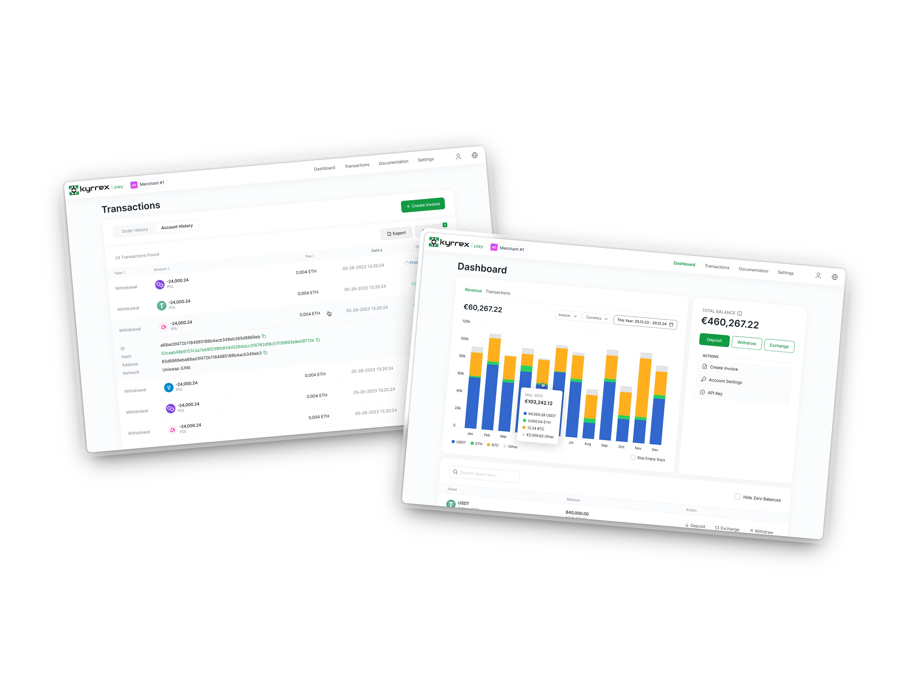

Kyrrex Pay lets a business accept crypto from its customers and settle in crypto or fiat. It is one piece of Kyrrex’s move from a trading venue into a full digital-finance ecosystem.
A first version had already been designed when I joined. I was brought in to take it further — which turned out to mean deciding who it was for before deciding what it looked like.
Kyrrex began as a place to trade and exchange crypto. As businesses joined the ecosystem they started asking for something the platform did not do: accept crypto from their own customers — especially in regions where traditional banking is slow or unavailable.
A version of Kyrrex Pay existed by then. What did not exist was an answer to who it was for. Three things followed from that:
No defined user. Nobody could say whether this was for a crypto-native exchange desk or a shop owner who had never held a wallet — and those two need opposite products.
An interface heavier than the task. Dated, and carrying more steps than sending an invoice warrants.
No shared design language. Every file carried its own UI kit, so the same component existed several times over with small differences between copies.
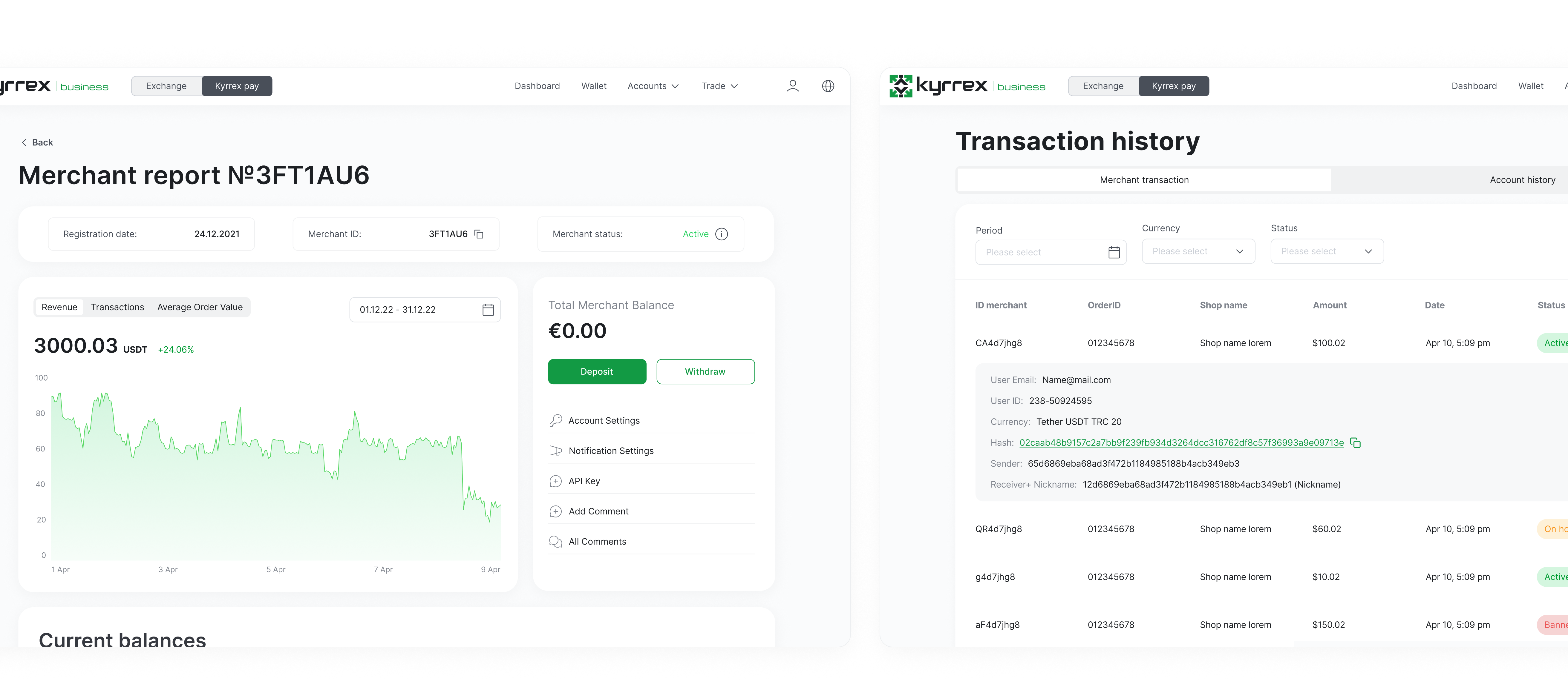
User interface of the app before improvements
Speed mattered, so the process kept only what was load-bearing: five steps and a standing line to product, compliance and engineering.
The order matters more than the list. Naming the user came before scoping, and scoping came before any screen — because the scope question on a payments product is not "what should it do" but "what does a first-time crypto payer have to trust before they will finish".
Frame it. Business goals, technical constraints and compliance needs, agreed with product and stakeholders before design starts.
Name the user. Decide who we are actually building for, and research what competitors get right for that person.
Cut the scope. Pick the MVP flows that make the first impression — invoice creation and payment tracking — rather than everything at once.
Draw it. Responsive screens in Figma against the shared system, so engineering inherits components rather than pictures.
Drive it. Clickable prototypes, internal feedback, and changes to the flows before anyone writes code.
Four flows, each chosen because it is a moment where a business decides whether to trust the product with money.
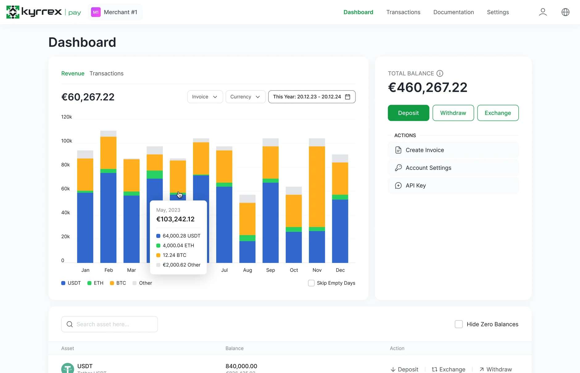
A business dashboard showing incoming payments, invoices and balances in one real-time view, so "did we get paid" is answered without leaving the page.
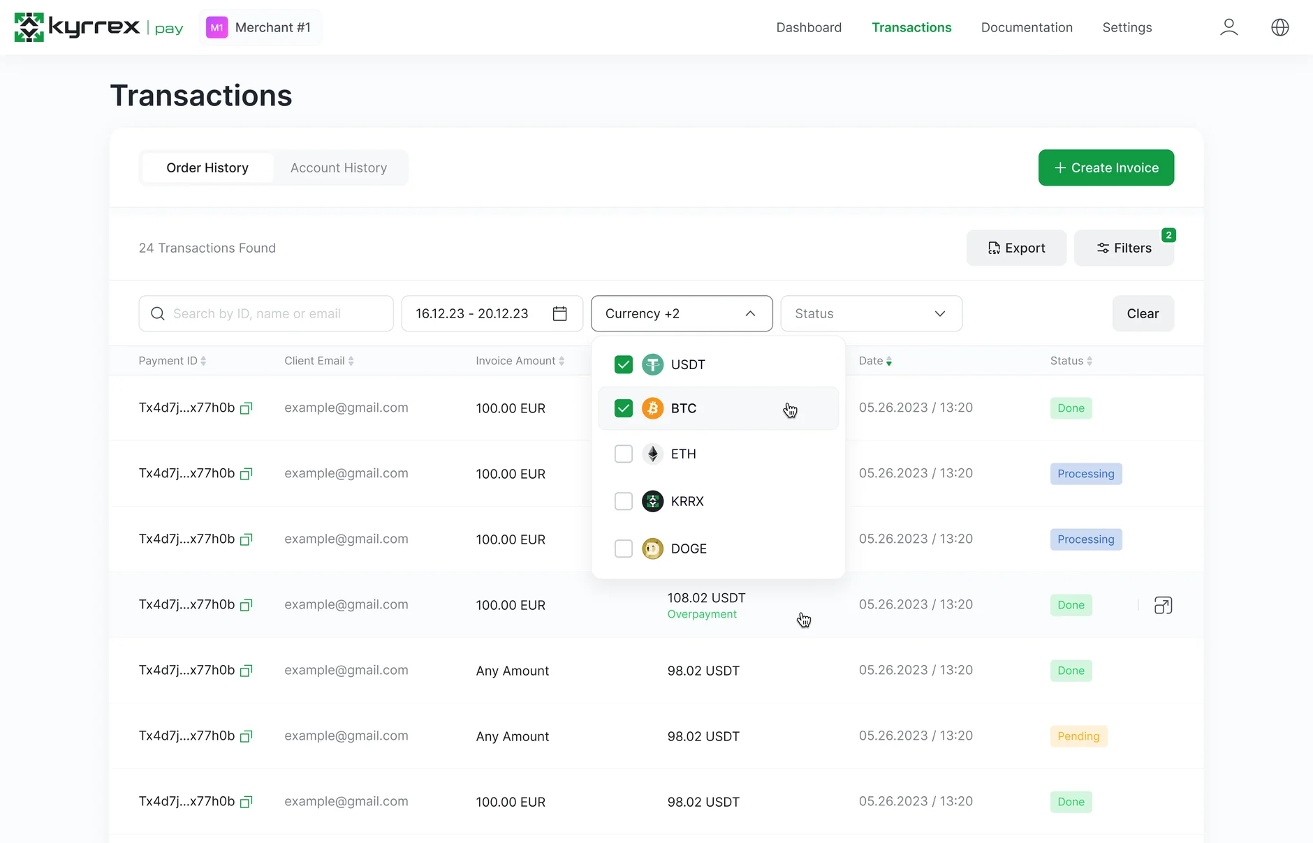
Invoice generation in seconds — dynamic pricing, QR codes and links, no technical setup. Every invoice carries status, wallet address, amount due and time remaining, which is the minimum a first-time crypto payer needs to not abandon it.
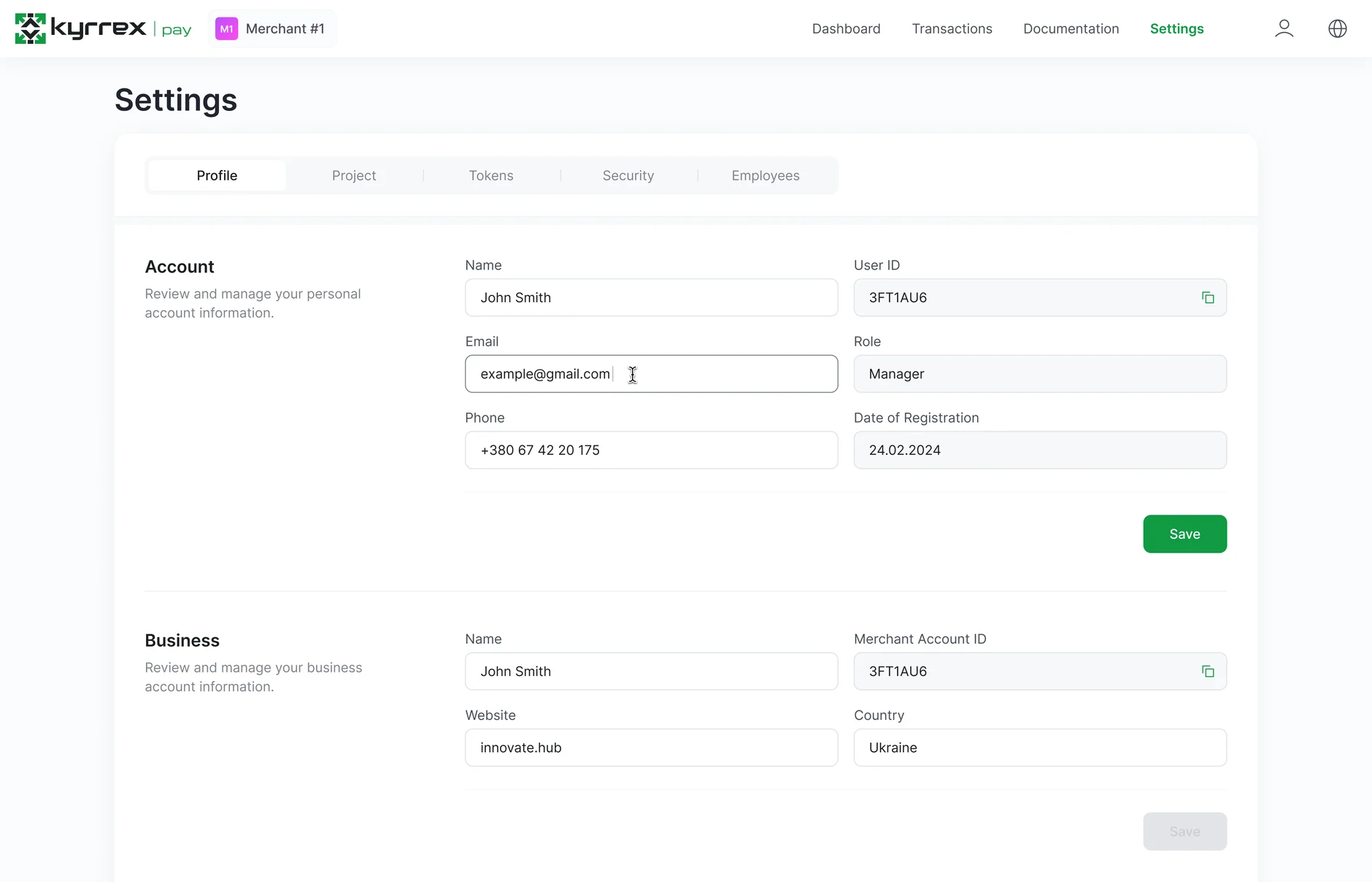
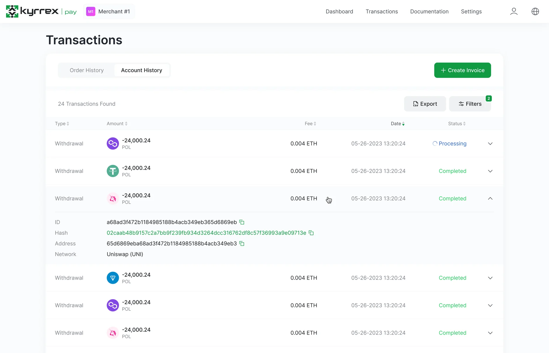
Multi-asset withdrawal, crypto or fiat, with payout rules and a step-by-step flow that keeps the compliant path the obvious one.
Underneath them, one design system: tokens and components in their own files on a 4px grid, replacing the per-file UI kits. The deletion is the part that mattered — a new library that sits beside the old ones is not a system, it is one more UI kit.
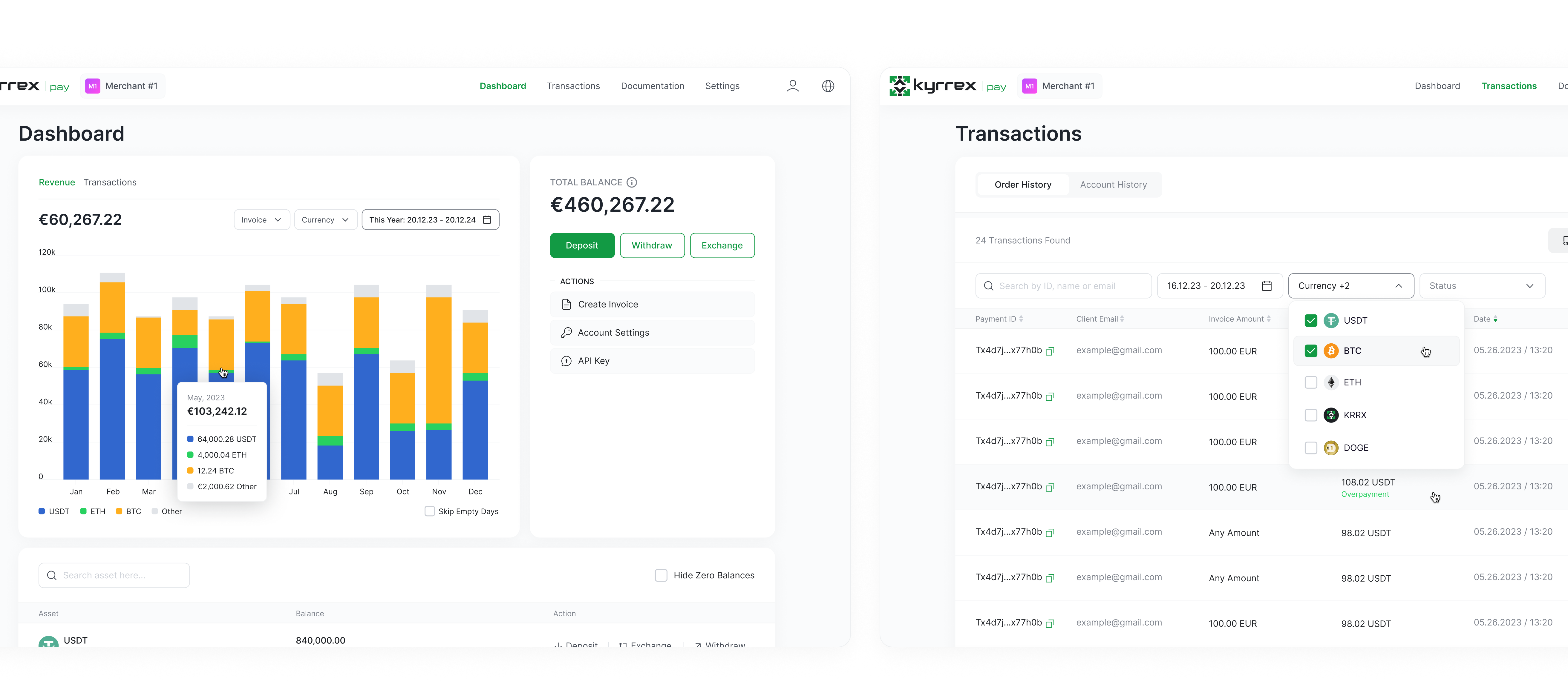
User interface of the app after improvements
I left before the rollout finished, so there is no usage number I can stand behind, and internal enthusiasm is not evidence. What exists that did not before: the first B2B payment product inside the Kyrrex ecosystem, and the design foundation the merchant tools after it are built on.
How I would measure it. Three numbers would tell you whether the work landed, and all three are cheap to instrument:
Invoice completion rate — of invoices sent, how many get paid. The single number that says whether a first-time payer trusts the page.
Time to first invoice — from signup to a merchant sending their first one. It tests the setup claim directly.
Withdrawal drop-off by step — where people abandon the compliant path, which is where the flow is still asking too much.