
Limitless is a prediction market — people trade on how sports, crypto prices and news turn out. I design the product there.
This is the story of deleting a page. Two of them, really: Profile and Portfolio, merged into the single address everything social now points at.
Identity lived on one page. Money lived on another. Profile held the avatar and the handle. Portfolio held positions, profit and loss, and history. One person, two addresses.
That was survivable until social arrived on the roadmap. Following someone, sharing a position, tapping a leaderboard row — every one of those links has to resolve to a person, and whichever page it resolved to, half the answer sat on the other one.
Mobile made it worse: the two pages were already near-duplicates there, and both were occupying navigation slots the feed and the leaderboard needed.
So the brief was never "redesign Portfolio". It was to make one canonical page for who somebody is and what they hold, before anything got built on top of the split.
Scope was fixed in writing before I opened a design file. No new data, so the page ships on what the platform already stores. Both old URLs keep working. Three phases, each behind its own flag.
One exception to "no new data": a single event recording which section people land on. Asking for one instead of ten is what got it approved — and it is the number that says whether the rail was the right call.
Then I stopped bringing flat frames to reviews. Every direction gets built instead — real tokens, real interaction, running in a browser, usually inside an afternoon. Since August that is 34 prototypes; this one is 466 commits across four weeks.
It scales because the rules are written down rather than re-decided each time: a house style guide the agent follows, a token file lifted from Figma and production, and per-prototype scripts that screenshot every state plus a smoke test that drives the page. The effect on a review is the whole point — it stops being "do you like this" and becomes "click it and tell me what breaks".
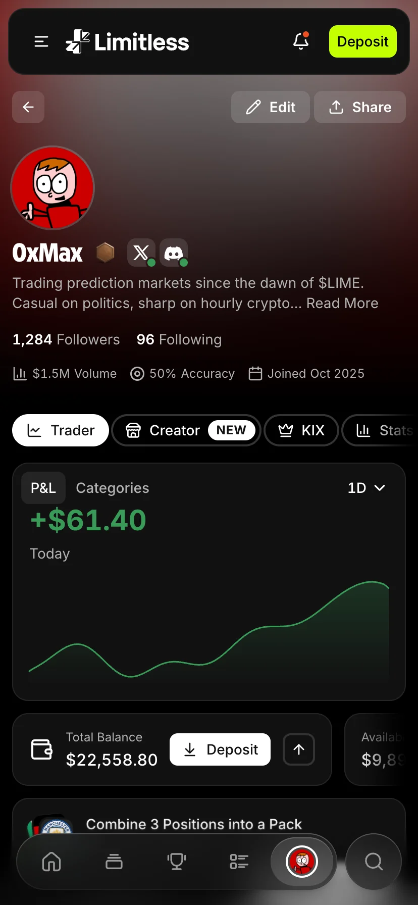
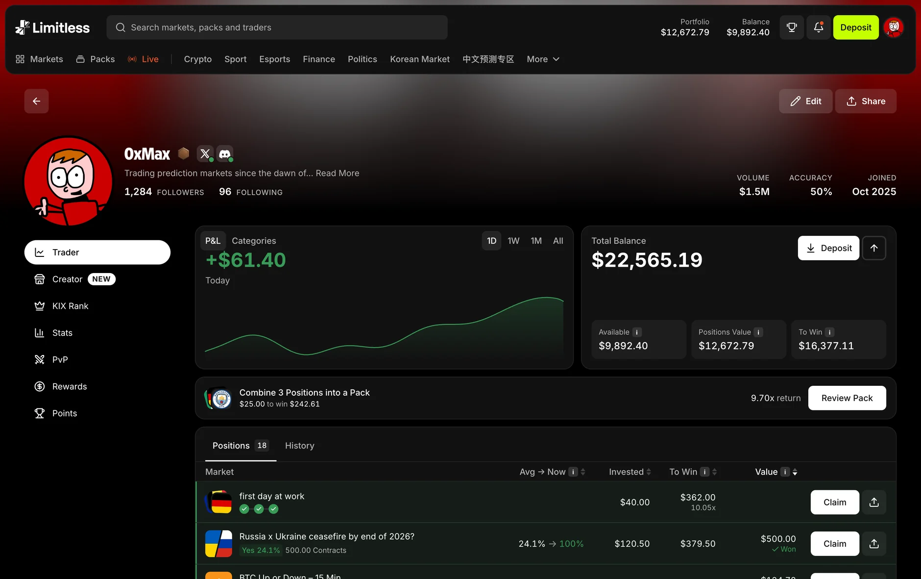
Identity reads across the top. Avatar, handle, bio, followers, then volume, accuracy and joined date ranged right. A banner rather than a column, because a column pushed the money into a gutter.
Seven sections run down the left — Trader, Creator, KIX Rank, Stats, PvP, Rewards, Points — each with its own address, so any of them can be linked to directly.
The money is one object. P&L and categories share the hero; total balance sits beside it and opens into available, positions value and what those positions pay if they win, rather than four cards competing for the same glance. The positions table is built around average price against price now, carrying a signed delta, so direction reads at a glance instead of being worked out.
The work I am most pleased with is the subtraction. Open Orders went entirely — trades and packs fill against a quote, they never rest on a book, so the tab was drawing something the exchange does not do. LP Rewards stopped being top-level and moved inside Rewards, following the programme being wound down. A navigation slot is expensive; it should not be spent on something on its way out.
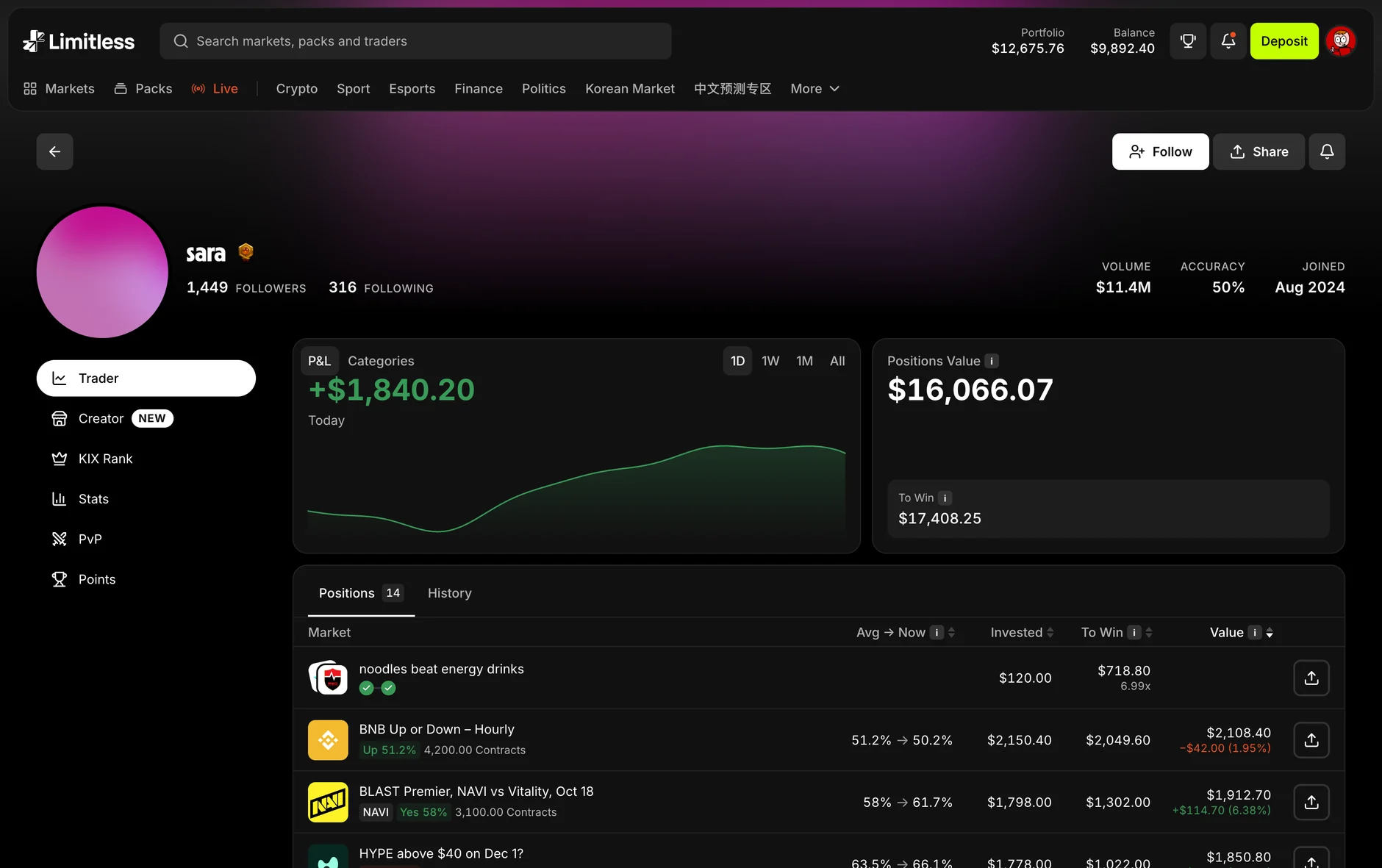
The test of whether the merge worked is opening somebody else’s page. Rewards disappears. The balance card drops to positions value and to win. Every row loses its sell and claim. What is left is identical to your own view — nothing on the page is something only you should see, which is exactly what makes one address a legitimate thing to send someone.
The measurement shipped with the design rather than after it, so four weeks in there is something to read. The numbers themselves belong to Limitless and are not mine to publish, but the shapes they make answer the three questions the design was built to settle.
The rail was the right call. The whole risk in replacing two pages with one was that people would open a profile, see Trader, and never touch anything else — which would have made seven sections an expensive way to draw one. They do leave Trader. Stats is the most-opened section after it by a wide margin, roughly double the next one down and close to ten times any of the social sections. People came for positions and stayed for the record of them.
The merge argument held. A real share of visits now arrive at a profile from somewhere else in the product entirely — a creator pack, a leaderboard row, the feed. Those are exactly the links that used to resolve to half an answer, and they now land on one address that carries both halves. Profiles get shared, too, which was the other half of the case for merging.
What it does not show. The instrumentation landed with the redesign, not before it, so there is no before-and-after and I will not claim the change caused anything. These are four weeks of unique-user counts, not conversion rates. And the sections nobody uses are the part I still owe an answer on — low traffic and broken tracking look identical from a dashboard, and I have not yet separated them.
One event, approved once. Asking for a single event instead of ten is what got measurement into the build at all — and it is the one that decided the rail.
The question came before the number. Each metric was written down with the thing it would disprove, so a flat result would have been a finding rather than a disappointment.
Phase two moves on evidence. It was specced behind a flag and waits on what this says, not on whether anyone liked the design review.