
Limitless is a prediction market — people trade on how sports, crypto prices and news turn out. I design the product there.
A pack is several outcomes bought as one bet, at one combined multiplier. The builder shipped in August and it worked. The problem was what happened afterwards: nothing.
A pack you built was yours alone. There was no wall to browse, no name on it, and no reason for anyone good at picking them to make a second one.
On its own terms the builder was fine. People opened it, filled packs and bought them. But the pack itself was thrown away at the moment of purchase — the judgement that went into choosing six outcomes survived exactly as long as the bet did, and then it was a line in somebody's history.
Meanwhile the people most likely to be good at this already had a record on the platform. Volume, accuracy, a profile anyone could open. None of it was attached to the one artefact where picking well is the whole skill.
So the brief was never "add sharing". It was to give a pack the three things that make it worth making twice: an author, an audience, and a price.
Same method as the profile merge: no flat frames in reviews. Every direction gets built — real tokens, real interaction, running in a browser — so a review stops being "do you like this" and becomes "click it and tell me what breaks".
That mattered more here than usual, because the hard question was not what the wall looked like. It was whether a pack reads as a person's opinion or as a product on a shelf, and that is not a question a static frame can answer. You have to scroll past forty of them.
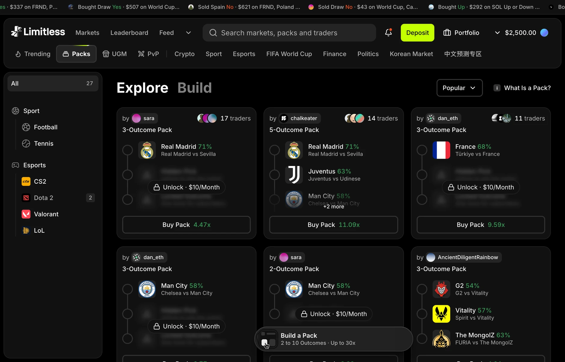
Every pack carries its author. The name and avatar sit at the top of the card, above the outcomes, not buried under them — and beside it the number of people who have taken the same pack. Those two lines are the whole argument: somebody chose this, and here is how many agreed.
The outcomes are the product, so some of them have a price. A card shows enough legs to judge the pack and locks the rest behind the creator's subscription. The lock is on the leg rather than on the card, because hiding the whole thing gives you nothing to decide with.
Building stayed one tab away, not one page away. Explore and Build are the same screen. Someone who came to browse and ends up wanting their own does not have to go and find the builder — which is where the old flow lost them.
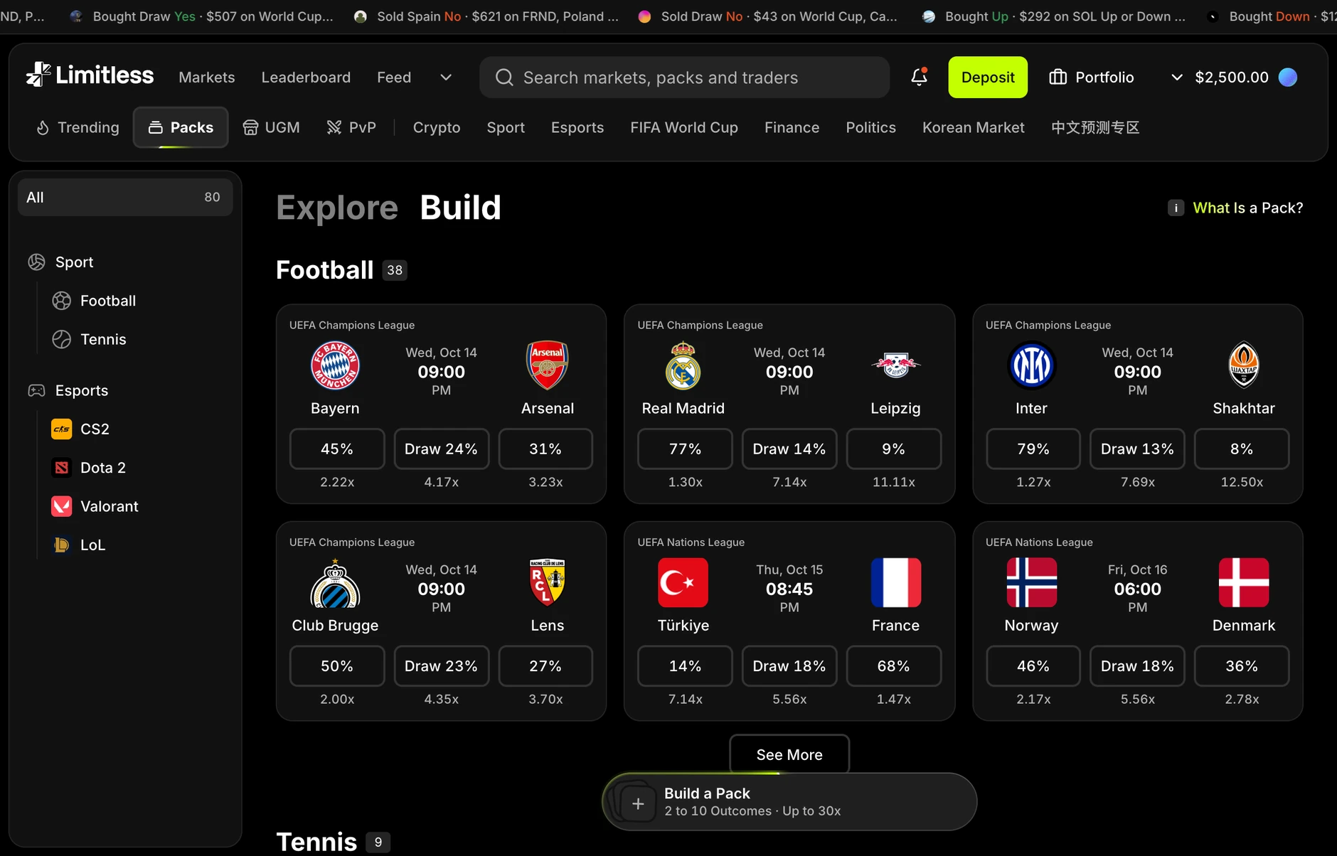
The Build side is the same list of live matches the rest of the product trades on, grouped by sport, with each outcome carrying its own multiplier so the combined number is never a surprise at the end. Two to ten outcomes, up to thirty times.
It shipped on 16 October 2026, measured against the thirteen complete days either side of that date. Packs built roughly doubled and purchases rose with them — and almost none of that is new people: unique builders went 75 to 86, buyers 88 to 90. The lift is intensity rather than reach, which is what you would expect if the thing that changed was having something to browse.
What it does not show. A separate builder release landed inside the "before" window, and the step only appears in the second week. The numbers are real and the direction is right, but this is a comparison, not a claim that the launch caused it.
An artefact with no author has no second version. The builder was never the problem; the missing byline was.
Lock the leg, not the card. A paywall over the whole pack removes the thing the decision is made on, and nobody subscribes to a rectangle.
Say which window the number came from. A fortnight either side of a launch that also contains somebody else's release is a comparison, not a causal claim — and the case study is where that gets written down.